For some time now, I’ve been calling out to my friends on Twitter to help me develop a logo.
Now I’m getting serious about it.
When you are consulting others on brand development, it is easy to make logo suggestions. But when it comes to you and your own “brand,” brainstorming a logo is VERY VERY hard.
Part of my problem is perfectionism. My “brand” is not a product. It is me. I AM MY brand. And therefore, I want my logo to represent me as best as possible.
I have no idea where to start with this project. And I’m seeking as much guidance and suggestions as possible. Do I use a photo? Do I use just fonts? Graphics? Beer? No beer? Ahhh … sooo confused.
I’m not very familiar with graphic designing programs. I’m sure with the right tools and instruction, I’d be pretty good at graphic designing (used to be an art geek in high school … and I have an affinity for computers). But lack of time and resources does not make this possible. So I’m relying on others to help me.
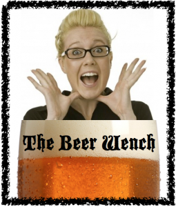
In the meantime, here is an absolutely ridiculous logo I designed myself … using a (super airbrushed) professional photo of me (in my skinny years) and my MAC. Yeah, go ahead and laugh. I deserve it.


I love the frames, you’ve got a great white-toothed grin, how about a more reflective look while sipping a foamy head and leaving a reminant on your upper lip. . . “Got Beer?”
The logo you created is actually pretty damned good.
Wish I could help, but I also had to recently beg for a new logo/banner for my site. My Photoshop skills are about a 3 on a 10 pt. scale.
Damn, I really want to help you with this. But I know I don’t have the time at the moment. :-/ Give me a few weeks?
I think that what you have is pretty good as it is, except you look surprised and kind of scared. Beer should make you happy looking! You should mimic my Avatar, after all, I have a “nose” for beer. Or- if you want to use my tail, I’ll take a picture of it wagging while I am thinking about beer! Hope that I can help!
ps- I’ll be more than happy to be the taste tester of the beer flavored bones….
I think that your logo looks good.
We used Elance.com and submitted a proposal. We eventually went with a guy from Michigan that was in Beer Country. (It just felt right.) We found him to be very reasonably priced and he gave us many formats and a few different colors.
I’ve got an idea or two. If you’re not in a terrible rush, I think I can have something for you in a week or two. My issue is I still do my artwork on cave walls with charcoal from the fire, and my scanner is down, but something popped into my head immediately. Will have to head over to the inlaws and scan when I’m done.
Kevin — sounds awesome to me! Send me an email when you scan it — drinkwiththewench@gmail.com!!!